
We've watched the same mini-program ship three times at three merchants, and walk into each one looking like a different product. Different buttons, different spacing, a slightly different blue. None of it was planned. It just happened, because each team started from a blank repo and a design file they half-remembered, and nobody owns the visual language once it leaves the first repo.
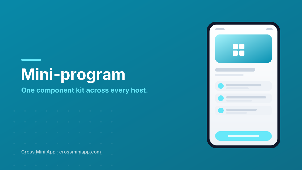
The fix isn't another Figma library to gather dust. It's a component kit that owns the visual language and refuses to let anyone draw around it. Build the kit once, ship it everywhere, and the question of what the product looks like stops being a question every team re-answers badly.
Tokens are the only thing that actually scales
A design system lives or dies at the token layer. Color, type, spacing, radius, elevation — if those are values in a file that components read, you have a system. If they're copied into inline styles on a Tuesday afternoon because a merchant wanted the card a hair taller, you have a screenshot with a long half-life.
We're opinionated about the order: tokens first, components second, screens last. A button should never contain a hex code. It should ask the token layer for the brand surface, the hover state, the disabled state, and trust that those exist. That sounds obvious until you audit a real mini-program and find the same primary color defined nine different ways across twelve files, each one a small act of faith that nobody will ever need to change it.
The discipline isn't about purity or taste. It's about what happens the day the brand updates the blue, or the radius goes from eight to ten, or legal asks for a higher-contrast text color. In a token-disciplined kit, that's one edit and a recompile. In a drifted one, it's a grep-and-pray across every merchant repo, and you will miss one — the one on the page that matters most.
Drift is a tax you pay forever
Every team that forks the UI pays a small, invisible cost up front and a large, recurring one later. The up-front cost is an afternoon. The recurring one is a design-system team whose real job is chasing inconsistencies a single kit would have prevented.
| Where the look drifts | Who notices first | What it actually costs |
|---|---|---|
| Spacing scales per screen | The merchant comparing two pages | Hours reconciling layouts that should match |
| One-off color patches | QA on a new host | Re-testing contrast the kit already passed |
| Custom button variants | The next developer on the repo | A fork nobody maintains, then a third fork |
| Hard-coded fonts | Low-vision users on system scale | The accessibility work the kit did, undone |
| Divergent motion rules | Users with vestibular needs | Reduced-motion support silently dropped |
The trap is that drift feels free. The first fork is a favor to a merchant. The hundredth fork is why your roadmap fills with cleanup tickets instead of features. Consistency isn't an aesthetic nicety; it's the thing that keeps your team working on the next merchant instead of re-teaching the last one.
Accessibility belongs in the kit, not in the audit
We wrote before about turning on a screen reader and watching the checkout disappear. The reason that keeps happening is that accessibility gets bolted on at the end, per screen, per team, usually under launch pressure. If the labelled component, the contrast-checked palette and the scalable type live in the kit, they ride along for free on every screen a merchant builds.
This is the quiet argument for a shared kit: it's the only place accessibility can become a default instead of a phase. A merchant doesn't decide whether their buttons have labels or whether the text scales. The kit decided that once, for everyone. That's the whole point of shipping one visual language instead of rebuilding it per team — the hard decisions get made where they can't be quietly undone.
A runtime is what lets the kit travel
Here's the part people under-sell. A design system is only as portable as the thing that renders it. If your kit is a set of framework-specific components and the host runs something else, the kit doesn't travel — the drift starts again right at the runtime boundary, and you're back to per-host UI.
A universal runtime changes that. When the same kit compiles down to one runtime every host understands, the blue stays the blue and the button stays the button whether the mini-program lands in a messaging app, a payments app or a merchant's own storefront. The visual language doesn't re-negotiate itself per host; it renders once, consistently, and the merchant's brand survives the trip.
That's the real promise behind one component kit: not that it looks identical everywhere, but that it never silently becomes a different product. One kit, one set of tokens, many merchants, many hosts — instead of a fresh rebuild every time someone opens a repo.
Sources
- W3C — Web Content Accessibility Guidelines 2.2 — the measurable baseline for contrast, names, roles and focus.
- web.dev — practical guidance on design systems, tokens and component discipline.
- MDN Web Docs — how token layers map to real styling primitives like custom properties.
- StatCounter GlobalStats — the platform and browser spread that explains why one host is never enough.
- Google Developers — Web Fundamentals — rendering and performance notes for cross-host delivery.